
I was so pleased a week or so ago when this camera made it into an Etsy Storque article! They sold right away, and, brought some great traffic to my shop. Since I know no one in Etsy Admin., and have no special knowledge or connections, I can only attribute it to my photos. People often comment on how much they like the "look" of my shop - especially the photos. I am grateful for the compliments, and, decided to try and share some of my own methods and strategies. I have both studied and taught design for years, and, spend a great deal of time on my photos - two attributes you may not have the luxury of sharing! - however, I will do my best to get you off to a good start.
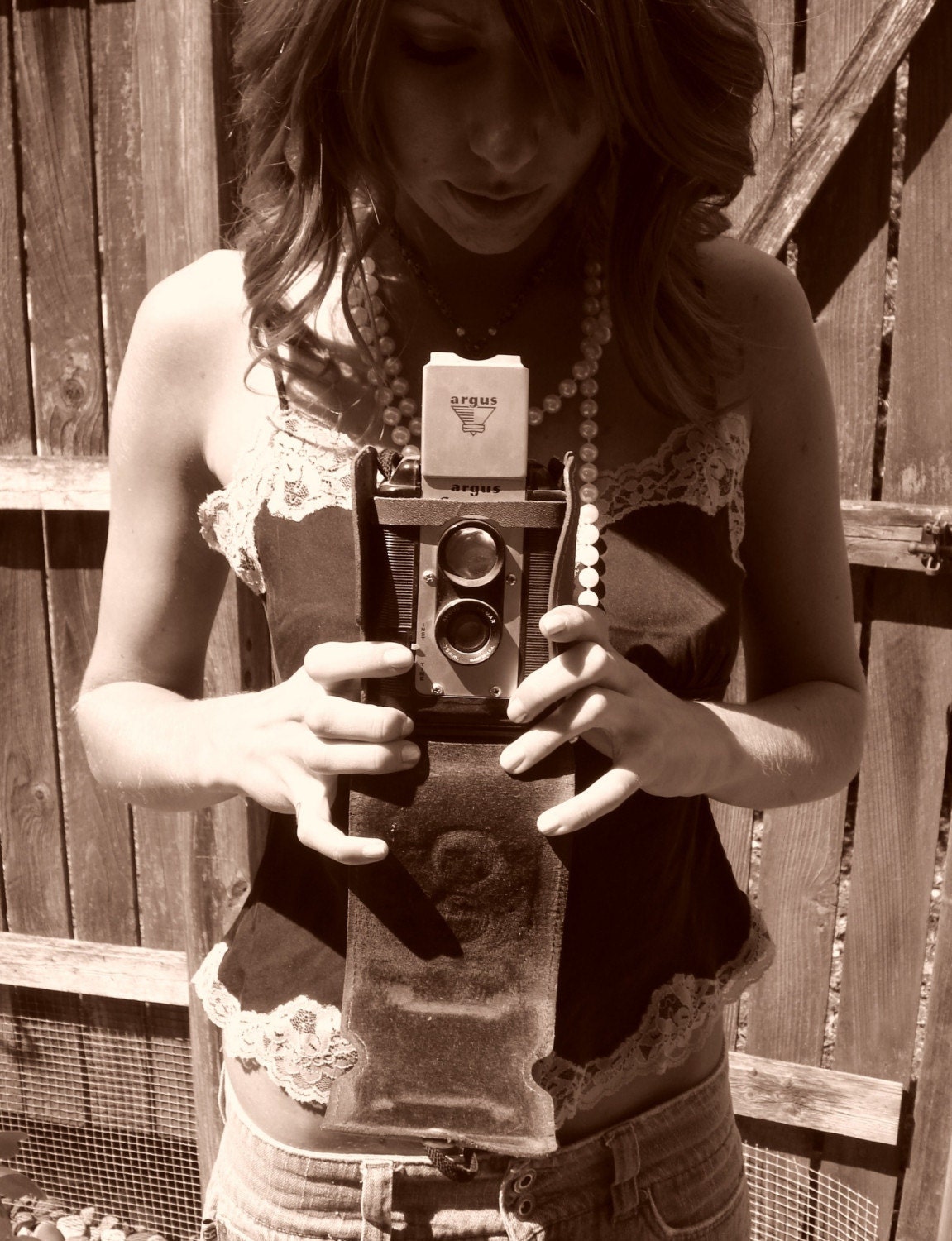
Since there are some good articles out there already on photographing jewelry, I am going to focus on vintage objects. Objects are tough for vintage sellers. They are often weird or boring shapes and sizes and trying to get them to look beautiful and engaging can be a challenge! The image above tells a story and looks good all at the same time!
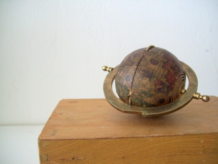
Composition is an important consideration, especially for that first photo. The fact that the list view images are square and the gallery images are rectangular poses a unique challenge! Personally, I search by list, but, others might search by gallery and many of the Etsy features - treasuries, Storque articles - use the gallery format. For this reason, when composing photos, I focus on the rectangle, and, try to keep most of the focal part of the image towards the center so it will be visible in the list view (square) as well. The rectangle used by Etsy is at a ratio of about 4:5. You can edit your first image to this proportion, or, use an image that will be cropped by Etsy and still work for you. The image above is a great example. Although this print is larger than the section shown, this edit works well in both the rectangular view and the square view. Each click is a visitor who can then read the details of the dimensions, condition, etc. You just need to get to the "click!" Composition is a topic for which I used to devote 12 weeks to teach at a basic level! A web-site that will give you some good visual design basics of using line, shape, color, balance, negative space, rhythm, patterns, and other elements in your composition is here.